Research & Development
Streamline
Internal perceptions around mobile at Custom Ink had long held that the experiential challenges of designing and ordering custom t-shirts for even a small group were likely too daunting to execute well on the small screen. In a way, our data reinforced that notion, with only a fraction of users who began their experience on a smaller device making it through to checkout before moving over to their desktop machines.
Having recently spent the last year leading a design effort that unlocked what I saw as our biggest mobile hurdle (Assisted Design) I believed that now was the time to shift that perception in bold and meaningful ways.
Innovation is rarely about true invention, but rather delivering true value. Our goal was to bring that value to the forefront, by peeling back the extraneous, streamlining the features that already made us the market leader, and creating a linear flow that made it all feel fun and easy. Oh, and as a secondary prompt for our approach, we assumed the roll of a competitor and asked ourselves, “If we were Amazon, or Wal-Mart, or Nike and wanted to take a piece of Custom Inks’ business, what would we build?”
Team
Jason Campos | Brand Experience Lead
Joe Zaczyk | Product Manager
Andrej Pancik | Represent Leadership
Michal Šimonfy | Represent Design Technologist
Timeline
2 Weeks | Working flex time, and free time
Custom Ink’s 2-Day Innovation Sprint
Deliverables
A full-featured, high fidelity InVision prototype
A lightweight, live version of the app, capable of placing a real order in our backend systems.
My Role
While partnering with a Product Manager on scope and strategy, my focus was to facilitate brainstorms, synthesize our best ideas, cross-reference them with an understanding of our products and customers, and distill it all down to a polished prototype for the people.
Opportunity
Dovetail a deep level of customer awareness and empathy with a passion for product to build a prototype that debunked the “limitations” of mobile and inspired decision makers to reexamine their perceptions around the opportunities inherent in a mobile-first approach to our customer journey.
Mission
Let’s create a dead-simple way to design and order custom t-shirts by building upon the strongest components of our current product, leaning into the advantages inherent on mobile, and standing on the shoulders of those who’ve built incredible experiences for the platform.
Words From the Wise
With deep understanding and a healthy dose of empathy for the problems our customers faced, we were setting out to untangle some of our product’s stickiest problems. In times like these, it can be comforting to look to your heroes for a little advice:
“Imagination is more important than knowledge.”
— Albert Einstein
“If it bleeds… We can kill it.”
— Major Alan “Dutch” Schaefer
Getting Started
A Critical Look at the Product’s Current State
With disparate components ranging from online shopping, to group ordering and split payments, to design and customization, there’s a ton of complexity wrapped up in our current end-to-end experience.
Take a moment to imagine designing and ordering custom t-shirts for your friend group, family, or business. Considering all of those people and their individual needs, where do you imagine you’ll find pain-points in the process? Picking a product they’ll all love? Nailing the design everyone will think is amazing? Collecting their sizes? Maybe you’re concerned about collecting your group’s payments?
For now, let’s break off a small slice and look at what often represents the first step in the customer journey, product selection. We have all the challenges associated with online retail around sizing, feel, and fit, but it’s further complicated by the fact that our products, when broken down by category generally look exactly the same. What might be the perfect t-shirt for your group, looks exactly like the other 500 t-shirts in its listing. So how do we differentiate our offering and make it easier for users to pinpoint the product that best fits their needs?
This would be our first challenge of many, and they were all filled with exciting possibilities. With a simple audit of what was already there, we amassed a growing list of questions, and a handful of compelling ideas.
Asking the Right Questions
What can we learn?
After diving deep on the customer journey, we broke each step down into their experiential building blocks and asked ourselves “Who out there is doing this one thing better than anyone else? And what can we learn from them?” Even with a team of just 2 people, this lead to rich conversation and fruitful competitive analysis.
What might we build?
We designed sneakers using Nike ID, walked through GoDaddy’s Website Builder, downloaded and created accounts for countless iOS apps that helped you shop, customize, request money, or just to see how they distilled a complex application down to a simple onboarding.
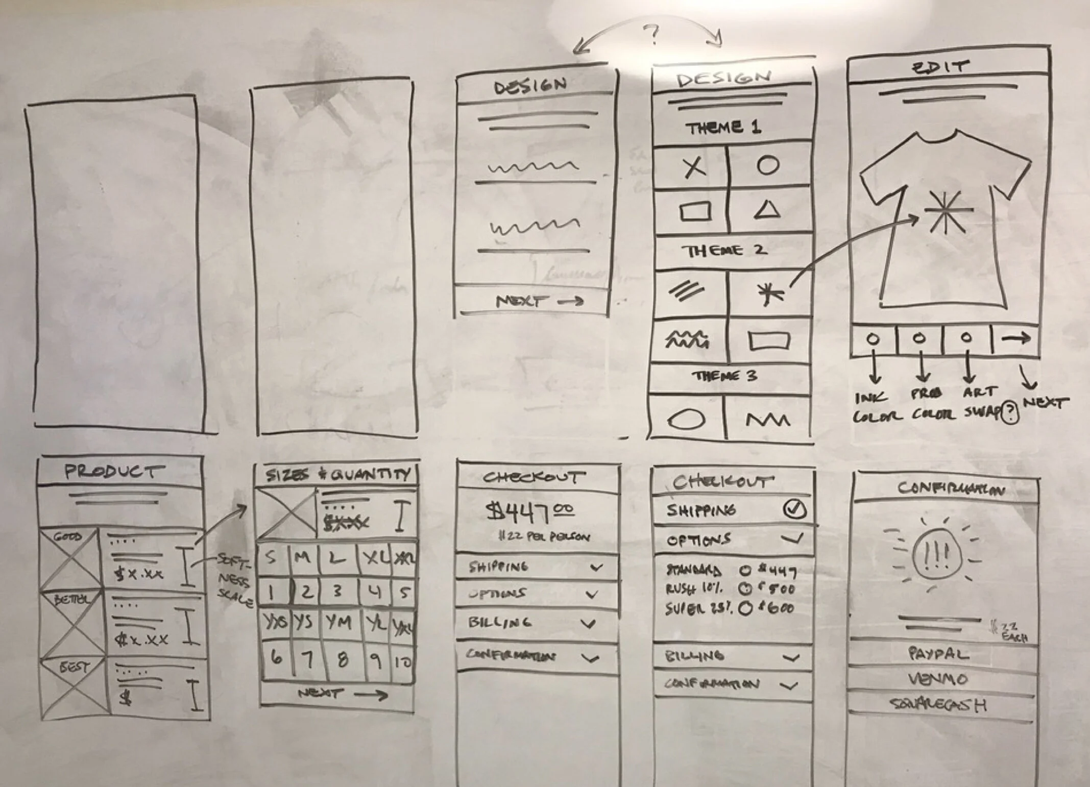
Then, using post-its we stood up a straw man, linear flow. We arranged and rearranged it. Debated the merits of each, and eventually settled on what would become one of many versions of our Streamline proof of concept.
Getting to Work
Improving on what’s good
You don’t have to have the answerers to all of your questions when you begin to prototype, but you do need to have a point of view, and an overarching philosophy in your approach. For us, it all came down to simplifying the overall complexity by asking our users a single question, and then doing everything we could to make answering that question feel easy.
Our current experience was filled with great ideas. We wanted to build on those, make them even better when possible, and introduce repeatable, consistent patterns that built cohesion into a new, unified flow.
…and adding a few new features
Our early process had surfaced some interesting new ideas, and I was able to take a first pass at bringing many of them into our wireframes. When attempting to shift perceptions around the potential of a product, it’s often less important to nail the nuance of each interaction, than it is to communicate the overall impact and value of the ideas behind them.
Good. Better. Best.
In the spirit of simplicity, we decided to make two major changes to the experience of picking a product.
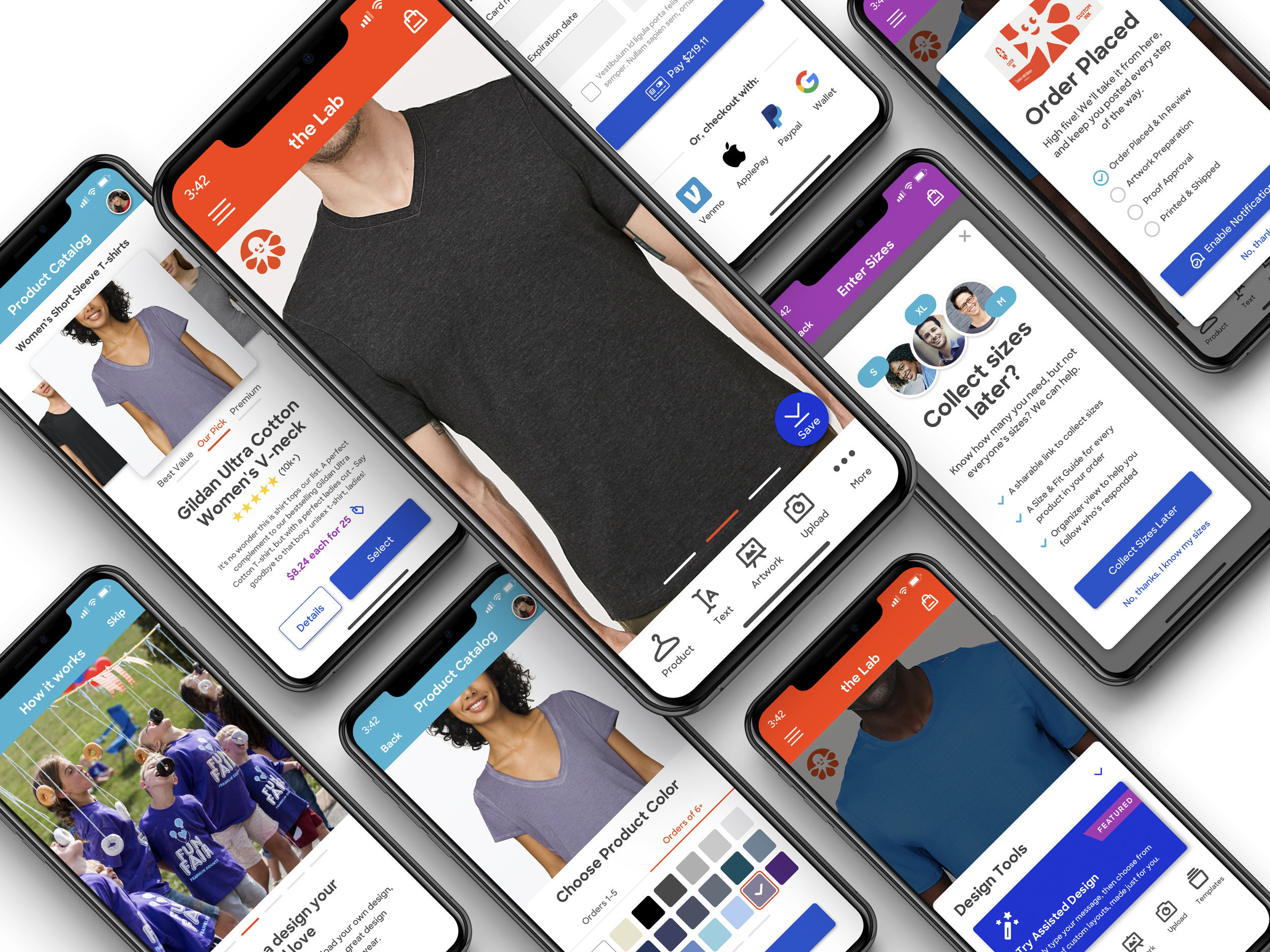
First, and most dramatically, we’d limit the selection of each sub-category to just three products. And second, we’d position those products as either a Value, Recommended, or Premium pick. This construct allowed users to easily select from a manageable set of choices and filter them further by their own motivating factors.
Ask Easier Questions
We have a full-featured product called Group Order Form that offers incredibly helpful tools for our group organizers. It allows them to collect sizes, payments, and shipping options from their group via a dashboard. But it also has a relatively complex setup process, and tends to push order dates for users who are often already up against a tight deadline. We believed that all orders are group orders, and opted to simply ask users if they wanted to “buy for their group” or “buy with their group”, and then intelligently tailor the rest of the flow to align with that intention.
Post-Order Promise
One of the perks of our app being installed on a customer’s phone, would be the ability to keep them in the loop via push notifications. In an effort to build equity and communicate value, we’d request permission to keep customers updated as their placed order moved through Operations and shipped out for delivery.
We wanted to drive home the notion that when a user places their order, that the relationship is just beginning, and that mobile presented us with the best possible platform for meaningful post-order engagement.
Roadshow
Prototyping and Pitching
in Prague
Our early explorations were already surfacing compelling new ideas and novel conceptual models. The rough wireframes that I’d been putting together were built upon some of the fledgling patterns I was developing for our Inkwell Design System, and they quickly began giving shape to our intentions.
After sharing an early prototype, we were asked to travel to Prague so that we might partner with the supremely talented designers and engineers working for a small crowdfunding startup (Represent) we had recently acquired. Together, we’d continue concepting and then pitch our idea as part of Custom Ink’s annual 2-day Innovation Sprint. On the flight over, I began adding fidelity to our sketches in an effort to hit the ground running with our two new collaborators overseas.
The Power of Printouts
The common area at Represent was a flurry of activity, and happened to have a pair of long community tables positioned at its center. With so many smart people moving through the space, I decided to print out our flow, pop a laptop running our current prototype, and engage interested parties in discussion. I can’t tell you how powerful this exercise was. We gleaned new insights, heard compelling narratives from outside of our working team, and effortlessly rearranged the flow, revealing unexpected dependencies and stimulating new thinking around our linear direction.
Placing Orders With a Prototype
As the 2-Day Innovation Sprint neared its conclusion, our best ideas, with the help of so many along the way, had transformed into a polished, highly compelling treasure map. We walked the team in Virginia through our design thinking, process, and prototype, ultimately using it to place a live order to our backend systems. We answered some great questions from the room, and proposed even more in response. We saw our ideas as seeds, and couldn’t have been happier about the fertile soil in which we’d been able to plant them.
Bringing It Home
Breaking It Down
In just 2 short weeks, we’d managed to unpack a ton of complexity, and systematically reshape it into a streamlined experience that our stakeholders could see and feel. We’d made our best features even better, introduced radical but intuitive new paradigms, and cracked open a new department-wide conversation about the potential of our product on mobile.
Here are just a handful of the concepts and constructs we were able to innovate against:
Alleviating the Paradox of Choice
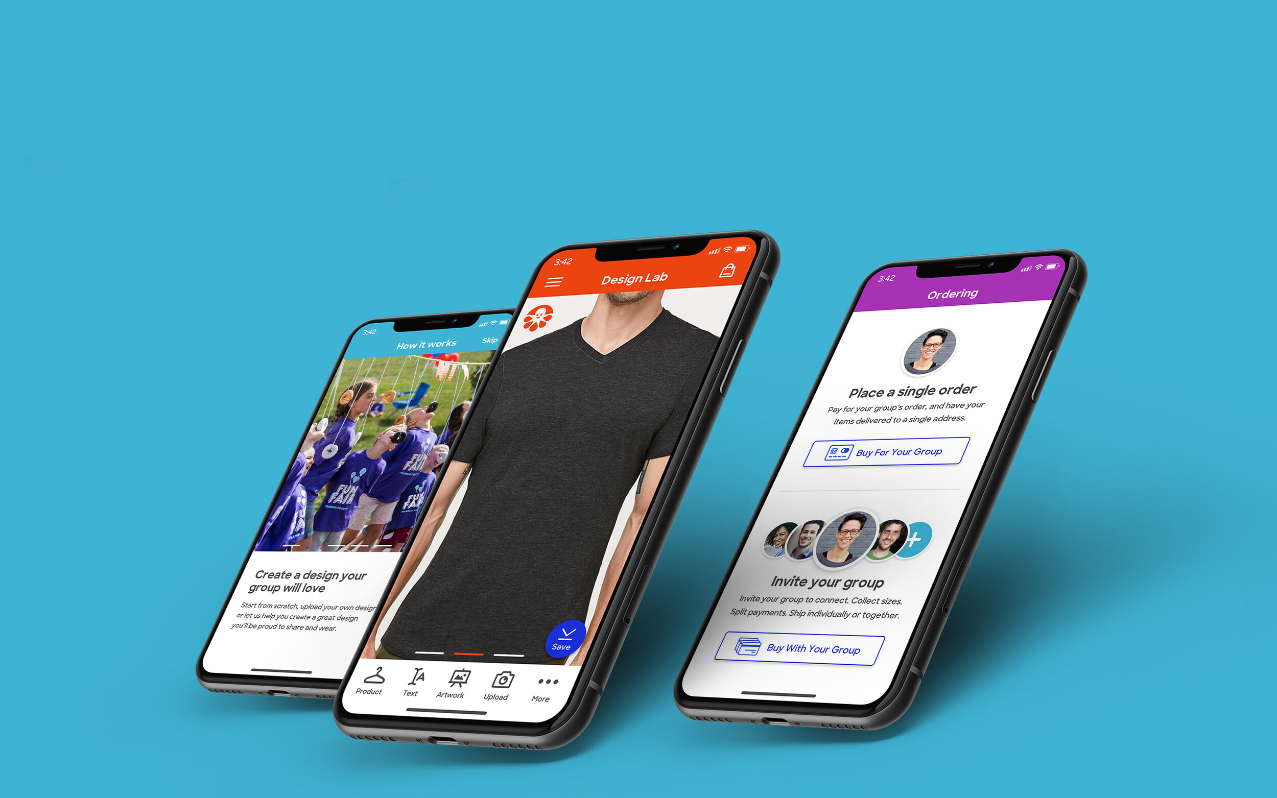
Consumers have a lot of options when ordering custom apparel. And setting expectations for what can be a daunting journey can mean the difference between a bounce and a buy. We added a short, but informative onboarding section that gave context for our tools and showed the end result that most people hoped for, happy groups united by the power of custom t-shirts.
And we made it easier to get to that finish line by removing a crippling sea of samesy products, highlighting our differentiated picks, and progressively disclosing breadth upon request.
Guidance, Every Step of the Way
We know that there’s something deeply intimidating about a blank t-shirt and a suite of unfamiliar tools. So we added a popover upon entering the Design Lab, featuring our most popular ways to get started with design, clearly communicating the benefits of each, and extending a helping hand for those who’d rather outsource the effort to one of our Expert Artists.
All Orders Are Group Orders
By asking group organizers a simple question, then clearly articulating the benefits of each choice, we’re able to elegantly move them onto the path of least resistance. This might sound like a logical way to bucket our buy pathways, but it represented a huge departure from our current experience, which required users who wanted to collect sizes and payment from their group to set up and activate a formal Group Order Form.
More Than Quality of Life Improvements
What I’d consider to be our most exciting innovation was a simple interaction that I initially had to fight to keep in the prototype. I called it Skip Sizes, and it was a direct reaction to years and years of observed user behavior. In short it allowed users to simply proceed with placing their order even when they didn’t know the sizes of everyone in their group. It kept the order on schedule, leveraged existing internal tools for helping organizers communicate size and fit, and obliterated a barrier in checkout that had a longstanding bounce rate.
What began as a controversial idea, had transformed septics into advocates, and to this day has champions internally who try to bring the feature to market.
Keeping Customers in the Loop
Last, but not least, we added powerful post-order features that helped communicate our commitment to quality, kept customers abreast of their order’s progress, and opened a line of communication we’d never had before via push notifications.
Collectively, these features represented the most cohesive and compelling expression of our brand yet, and paved the way for loads of departmental innovation.
Next Steps
Trickle Down Innovation
Our demo had turned some heads, raised the bar for upcoming design efforts, and most importantly, stimulated departmental appetite for many of the big ideas we brought forward. Without a short-term strategy for getting an iOS app on the roadmap, upon returning home we were asked to run our Streamline design thinking through the current style guide. This allowed fire-teams to opportunistically break off, test, and implement features à la carte.
When it comes to shifting department-wide perceptions, it’s critical that you be able to justify the work associated with change. By proving that innovative ideas paired with rock-solid UX could amount to so much more than simple quality of life improvements for our customers, we were able to illuminate a way forward for mobile that was rife with opportunity, and foundational for our future.
While the short-term benefits of our work were limited to piecemeal implementations within our existing flows, our output over just a few short weeks would serve as a deep well of inspiration for our working teams, and one hell of a head start on a fully featured iOS app.


